
Resources
Looking for marketing help? Dig into our library below.

Ebooks
Download in-depth guides packed with strategies, case studies, and practical tools to elevate your marketing and advocacy efforts.
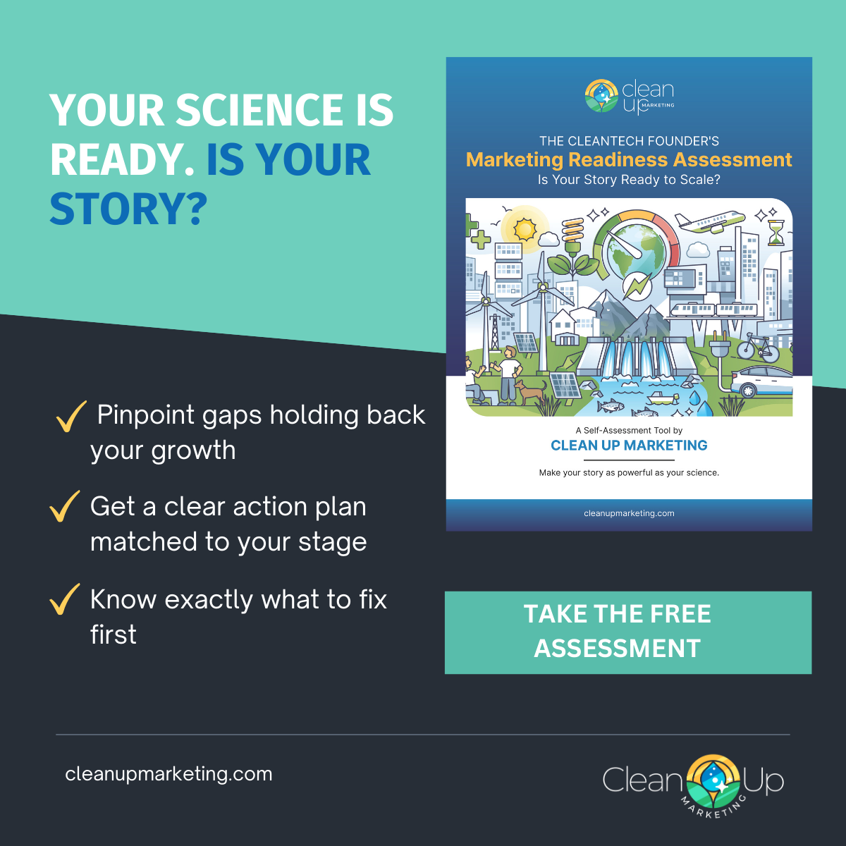
Marketing Readiness Assessment Guide
Is your story ready to scale? Take this 5-minute self-assessment to find the gaps holding back your fundraising, sales, and growth.

Blog
Dive into expert tips, industry trends, and behind-the-scenes insights from our work helping clients build powerful marketing campaigns.

Videos
Explore marketing insights and see examples of the video content we've created for client campaigns.
Download our newest ebook:

Your cleantech breakthrough deserves attention—make sure your message gets it. In today’s crowded market, clear, compelling storytelling is key to attracting investors, customers, and policymakers.
Download this FREE eBook to discover:
✅ How to build a message that connects
✅ Common mistakes to avoid
✅ Proven ways to stand out in cleantech
Perfect for startups raising funds or companies ready to scale.
Need Marketing Help? Dig Into Our Free Library!


Explore Our Video Insights
Dive into our curated selection of videos that showcase the power of effective marketing strategies in the climate tech sector. Each video is designed to inspire and inform, helping you understand how to elevate your brand and make a lasting impact.